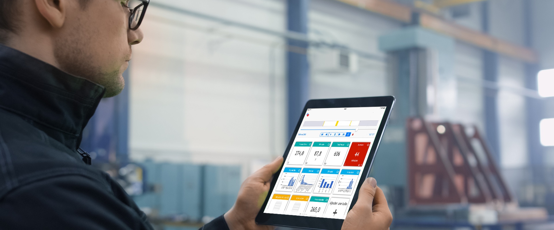
Our series on manufacturing giveaway continues with key performance indicators. What are the best KPIs to display on a dashboard in real-time to reduce overproduction to its simplest form? Here are five KPIs to consider.
Once the data is collected automatically in real-time through connectivity to a specific piece of equipment (ex: weigher) or to the database (which records each unit weight,) the collected information can be combined and displayed on the dashboard :

1. Giveaway goal by product by percentage
To better quantify improvements to be made as part of a continuous improvement approach, it is necessary to measure giveaway for a certain period of time at the beginning of a project in order to set realistic goals. These goals can be reviewed and set higher over time as performance improves.
Take, for example, a giveaway goal to be reached (and not exceeded,) of 2% for a 100 g bag of nuts. A giveaway rate goal set at 2% can represent considerable raw material savings. If we compare with a rate of 5% per 100,000 units produced, we are talking about 300 kg of nuts. Instead of being "given" away, they can be sold.

2. Current rate of overproduction by product
Once a target has been set, it's important to track production in real-time to see if you are meeting or even exceeding the goal value. Considering a rate of giveaway of 0.2% for a target of 2% on the product example given above (nuts,) the manufacturer is rigorously controling giveaway by ensuring product overproduction is kept as low as possible.
3. Total amount of giveaway per product by weight (e.g., kg)
In addition to the actual percentage and goals, the total amount of giveaway (by weight) is another key performance indicator to keep an eye out for overproduction control. If the percentage gives you a general idea of the giveaway, the exact weight measures coming from the scales (in kgs) might be a more tangible number as you can quickly see the amount of raw material lost or "given" rather than being sold.
In the nuts example above, the amount is 0.9 kg, which is excellent. Imagine if it was more like the 300 kg nut manufacturing example above, dollar losses would increase more than is desirable, especially if we consider giveaway as maintained on long period.
4. Evolution of the amount of overproduction over time (e.g., kg/hour)
Graphs that track the evolution of the total quantity of product overproduced allow you to quickly visualize the variations of giveaway over time. Whether for a day or several months, the graph data will guide the investigation. Is the amount of giveaway more prominent at the beginning of the shift? When employees return from a break? Are the standards easier to meet in the days following machine maintenance? The answers to these questions will guide corrective measures to implement in order to reduce giveaway to its simplest expression.

5. Evolution of the rate of overproduction over time (e.g. %/hour)
Finally, real-time sharing of the rate of giveaway—in percentage per hour—may have the effect of mobilizing troops on the floor. By sharing key performance indicators in real-time on screens installed on the factory floor, it's easier to engage employees in achieving goals. By noting a slowdown, working groups can react quickly to correct a situation and the comparison between different teams could also lead to healthy competition.
If you produce fixed-weight items and are curious to see the TileBoard app in action, schedule a demo with one of Worximity's smart factory experts. You'll complete a giveaway self-diagnostic that will allow you to gauge the potential gains you can make by reducing giveaway right now.


